Fall-natic Challenge Branding
Project
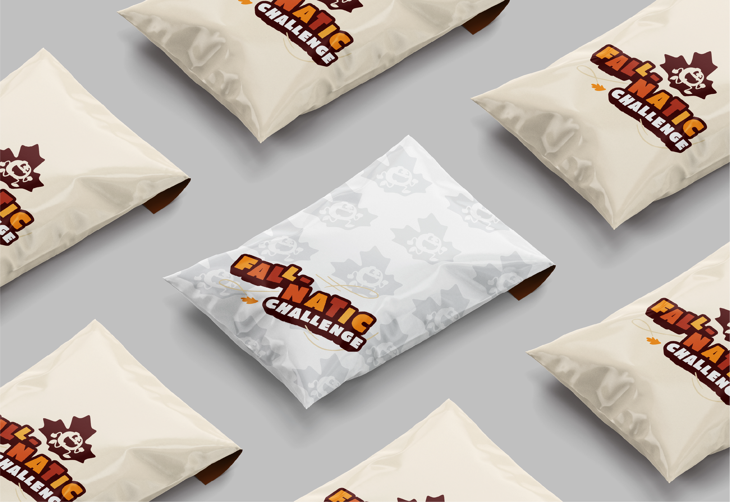
The Fall-natic Challenge is Gourdy’s Pumpkin Run’s seasonal challenge concept, created to carry the spirit of fall beyond race day. It needed a visual identity that felt clearly connected to the Gourdy’s universe while still standing on its own. We developed a logo that introduced the challenge as a recognizable sub-brand within the broader event brand. 🍂
Client
Sour Fish Events
Category
Visual Identity / Logo / Branding
We created a flexible logo system centered around a combined primary logo consisting of both a custom wordmark and a standalone brand mark. Designed to work both together and separately, the system allows the identity to adapt across a wide range of uses and formats. The wordmark functions as a secondary logo, while the leaf-shaped mark was developed to work as a compact brand element for applications such as app icons, patterns, badges, and supporting graphics.
The visual direction was rooted in the whimsical, nature-inspired character that Gourdy’s Pumpkin Run is known for, while also aiming for a more refined and lasting expression. The color palette was carefully chosen to sit naturally within an autumnal space without feeling overly themed, cheesy, or disposable. Instead, the result balances warmth and seasonal familiarity with a more serious, modern tone. To further tie the identity back to the event universe, the mark also incorporates a silhouette of Gourdy, the race mascot, helping connect the new challenge branding to the larger brand in a subtle and memorable way.
Want to work together?
We would love to chat about your upcoming project!